Data and descriptive statistics
UAT 106 Statistics and Data Analytics for Technology
Lesson
By the end of this module you will be able to
- Tell data types apart, distinguish population from sample, and identify the experimental unit correctly
- Calculate central values, standard deviation, percentiles and interquartile range in Python
- Read a box plot and flag outliers with the 1.5 IQR rule
- Distinguish trueness from precision, and calculate bias and RMSE
Why this matters
One drone flight can produce hundreds of thousands of numbers: altitude, speed, battery voltage and image-processing time. Nobody can read that many raw values. Descriptive statistics reduce data to a few numbers that say where the data sits, how widely it spreads and what is unusual. Summarise it the wrong way, for example by using the mean on heavily skewed data or by counting log points as flights, and the conclusion is wrong from the start.
The data in this course is synthetic, generated from models by make_sample_data.py for practising analysis only. It is not a test result for any real drone. Download it from /downloads/uat-106/.
Types of data and the experimental unit
| Type | Meaning | Drone example |
|---|---|---|
| Nominal | Categories with no order | Battery brand, flight mode |
| Ordinal | Ordered, but gaps are not equal | Risk level low, medium, high |
| Interval | Gaps are meaningful; zero is not “none” | Temperature in °C |
| Ratio | True zero; ratios make sense | Endurance, payload, distance |
The population is everything we want to know about, such as every flight this battery model will ever make. A sample is the part we actually measure. Statistics uses a sample to say something about the population.
The experimental unit is the thing measured independently. If the question is “how long does this battery model fly?”, the unit is the flight, not a data point in the log. A thousand log points from one flight are not a thousand independent flights. This mistake is very common and makes analysts far more confident than they should be.
import pandas as pd

hover = pd.read_csv("hover_error.csv")
err = hover["alt_err_m"]
print(len(err), "samples from ONE hover flight, sampled every", hover["t_s"].diff().iloc[1], "s")
print(f"mean {err.mean():.3f} m   median {err.median():.3f} m   sd {err.std():.3f} m")
print(f"min {err.min():.3f} m   max {err.max():.3f} m")
600 samples from ONE hover flight, sampled every 0.1 s
mean -0.002 m median -0.001 m sd 0.127 m
min -0.735 m max 0.897 mCentre and spread
- Mean: the sum divided by the count; sensitive to outliers
- Median: the middle value of the sorted data; robust to outliers
- Standard deviation (SD): how far data typically lies from the mean, in the same unit as the data
- Percentile: the value below which a given share of the data lies; p95 is the value that 95% of the data does not exceed. The quartiles Q1, Q2 and Q3 are the 25th, 50th and 75th percentiles.
The sample standard deviation divides by , not , because the mean was computed from the same data, which makes the distances look slightly smaller than they really are. Dividing by corrects for that. Beware: tools use different defaults.
import statistics
import numpy as np

flights = [21.8, 22.0, 22.5, 23.9, 24.1]
print(f"stdev (n-1) {statistics.stdev(flights):.3f}   pstdev (n) {statistics.pstdev(flights):.3f}")
print("pandas .std():", round(pd.Series(flights).std(), 3), "  numpy np.std():", round(np.std(flights), 3))
print("statistics.quantiles:", statistics.quantiles(flights, n=4))
print("numpy.percentile:    ", np.percentile(flights, [25, 50, 75]).tolist())
stdev (n-1) 1.074 pstdev (n) 0.960
pandas .std(): 1.074 numpy np.std(): 0.96
statistics.quantiles: [21.9, 22.5, 24.0]
numpy.percentile: [22.0, 22.5, 23.9]pandas .std() divides by , but numpy np.std() divides by unless you pass ddof=1. The quartiles from statistics.quantiles (exclusive method) and numpy.percentile (linear method) differ on small data. Neither is wrong, but you must report the method so others can reproduce your numbers.
Example 1 Image-processing time on an edge computer
The 200 frames in latency.csv are right-skewed: a few frames are very slow. The “Edge benchmark” knowledge unit of the drone knowledge hub recommends reporting p95 alongside a central value.
lat = pd.read_csv("latency.csv")["latency_ms"]
print(f"mean {lat.mean():.1f} ms   median {lat.median():.1f} ms")
print(f"p95 {lat.quantile(0.95):.1f} ms   max {lat.max():.1f} ms")
mean 42.3 ms median 40.5 ms
p95 62.6 ms max 79.4 msThe mean is above the median because slow frames pull it up. If processing must finish within 60 ms, a mean of 42 ms looks comfortable, but a p95 of about 63 ms says that at least 5% of frames are slower than the limit (the actual count is 14 of 200 frames, 7%). The summary you choose must match the question.
Box plots and outliers
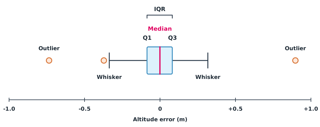
A box plot, as described in the NIST statistics handbook, summarises data with five values. The box runs from Q1 to Q3, so its width is the interquartile range (IQR). The line inside is the median, the whiskers reach the furthest data still inside the fences, and points outside or are drawn separately as outliers to investigate.
q1, q3 = err.quantile([0.25, 0.75])
iqr = q3 - q1
low, high = q1 - 1.5 * iqr, q3 + 1.5 * iqr
print(f"Q1 {q1:.3f}  Q3 {q3:.3f}  IQR {iqr:.3f}  fences [{low:.3f}, {high:.3f}]")
print(hover[(err < low) | (err > high)].to_string(index=False))
Q1 -0.086 Q3 0.082 IQR 0.167 fences [-0.337, 0.333]
t_s alt_err_m
21.5 0.897
43.0 -0.735
58.3 -0.372There are three outliers. Two, at 21.5 and 43.0 seconds, are far from the rest; the one at 58.3 seconds is just past the fence. The 1.5 IQR rule is only a signal to investigate, not an order to delete. Go back and find the cause, such as a wind gust or a sensor fault. If you remove data, report why and give results both before and after removal.
Trueness, precision, bias and RMSE
The International Vocabulary of Metrology (VIM, JCGM 200:2012) separates three terms:
- Trueness: how close the average of many repeated measurements is to a reference value; lack of trueness is bias
- Precision: how close repeated measurements are to each other
- Accuracy: how close a measurement is to the true value, combining both. VIM notes it is a concept, not a quantity that can be given a number directly.
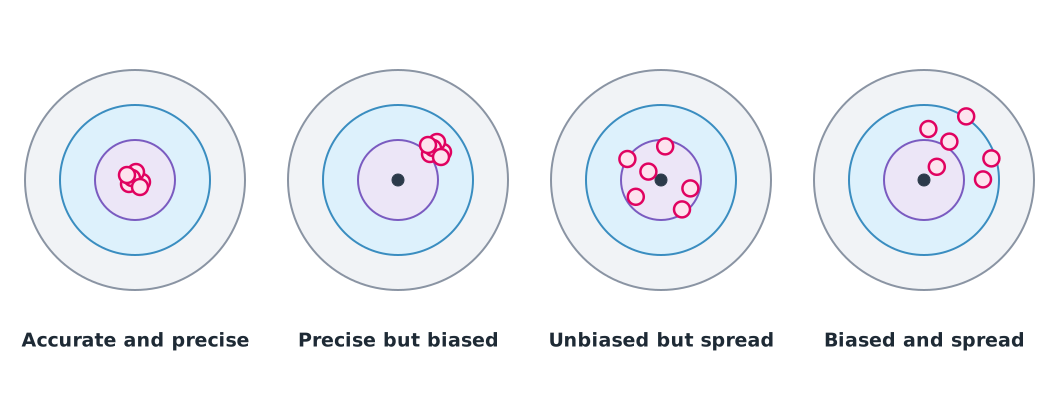
In map checking, the error is the map value minus the reference value at a checkpoint. Bias is the mean of , and RMSE is the root of the mean square, which combines bias and spread. This example uses the four synthetic points from the knowledge unit on checking map accuracy.
e_z = np.array([0.10, 0.00, -0.10, 0.00])
for label, e in [("as measured", e_z), ("with +0.20 m offset", e_z + 0.20)]:
    print(f"{label:<20} bias {e.mean():+.3f} m   RMSE {np.sqrt(np.mean(e ** 2)):.3f} m")
as measured bias +0.000 m RMSE 0.071 m
with +0.20 m offset bias +0.200 m RMSE 0.212 mZero bias does not mean zero error, because positive and negative errors cancel. When every point shifts up by 0.20 m (for example, from using the wrong height datum), both bias and RMSE rise, so always report both.
Module lab
Lab: summarising a hover
- Load
hover_error.csvwith pandas, compute every summary in this lesson, and draw a histogram and a box plot with matplotlib. - Remove the two obvious outliers, recompute the SD, and write a short report showing results before and after removal, with reasons.
- Compute p50, p90, p95 and p99 of
latency.csvwith bothnumpy.percentileandstatistics.quantiles(n=100), and compare the differences. - Using the checkpoint data from the knowledge unit on checking map accuracy, compute bias and RMSE separately for E, N and Z.
Common mistakes
Watch out
- Counting log points as flights, which inflates the data hundreds of times over
- Using the mean on skewed data without looking at the median or percentiles
- Not knowing whether a tool divides by n or n−1, so your SD does not match anyone else’s
- Silently deleting outliers to make results look better
- Reporting bias alone, which can be zero even when individual errors are large
Summary
- Identify the data type and experimental unit before calculating; log points within one flight are not independent samples
- Pair the mean with the median and the SD with percentiles, and always report the calculation method
- Box plots and the 1.5 IQR rule point to data to investigate, not data to delete
- Trueness relates to bias, precision to spread, and RMSE combines both
Check your understanding
- What type of data is flight mode (MANUAL, AUTO, RTL)?
- What is the sample standard deviation of endurance values 20, 22 and 24 minutes?
- With Q1 = 10 and Q3 = 18, above what value is a point an outlier under the 1.5 IQR rule?
- For errors of +0.03 and −0.03 m, what are the bias and RMSE?
- An altitude log has 36,000 points from 3 flights. How many independent samples are there if the question is “mean endurance”?
Answers
- Nominal, because it is a set of categories with no order
- The mean is 22; the sum of squared deviations is , so minutes
- IQR = 8, so the upper fence is
- Bias m and RMSE m
- Three, because the experimental unit is the flight
Key formulas
| Mean | |
| Sample standard deviation | |
| Box-plot outlier fences | |
| Bias and RMSE |
Key references
- Montgomery, D. C., & Runger, G. C. (2018). Applied statistics and probability for engineers (7th ed.). Wiley. link
- Diez, D. M., Çetinkaya-Rundel, M., & Barr, C. D. (2019). OpenIntro statistics (4th ed.). OpenIntro. link
- NIST/SEMATECH. e-Handbook of statistical methods. National Institute of Standards and Technology. link
- NIST/SEMATECH. Box plot (section 1.3.3.7). e-Handbook of statistical methods. link
- Python Software Foundation. statistics — Mathematical statistics functions. The Python standard library (3.14). link
- NumPy developers. numpy.percentile. NumPy documentation. link
- JCGM. (2012). International vocabulary of metrology — Basic and general concepts and associated terms (VIM, JCGM 200:2012). BIPM. link
- McKinney, W. (2022). Python for data analysis (3rd ed.). O'Reilly. link
Further reading
Study the assigned knowledge units in advance, review media and take the module quiz
Descriptive statistics and probability distributions
Checking accuracy and troubleshooting maps
Edge benchmarking and deployment planning
In class / field
Lab or field practice from worksheets with a safety checklist
Learning evidence: Checked worksheets and quiz results