Data analysis with pandas
UAT 106 Statistics and Data Analytics for Technology
Lesson
By the end of this module you will be able to
- Check the structure, types and completeness of data before analysis
- Summarise data by group with groupby and cross-tabulation
- Calculate correlation and linear regression, check residuals and beware of extrapolation
- Use Anscombe's data to explain why you plot before trusting numbers, and turn PX4 logs into tables
Why this matters
Test data from dozens of flights carries several variables at once: battery brand, payload and flight order. Mission planners want to know “how much endurance do we lose per extra kilogram?” pandas from UAT 104 organises the data, and correlation and regression answer the quantitative question, but summary numbers can mislead if you never look at a plot.
Check the data before analysing it
endurance.csv is synthetic data from 24 flights: two battery brands, three payloads, four flights each, flown in the randomised run_order.
import pandas as pd

df = pd.read_csv("endurance.csv")
print(df.dtypes.to_string())
print("missing values:", int(df.isna().sum().sum()), "  rows:", len(df))
print(pd.crosstab(df["battery"], df["payload_kg"]))
flight_id str
run_order int64
battery str
payload_kg float64
endurance_min float64
missing values: 0 rows: 24
payload_kg 0.0 0.5 1.0
battery
A 4 4 4
B 4 4 4Check three things before calculating anything: are the data types right (numbers not read as text), are there missing values, and does every group have the planned number of flights? The cross-tab confirms four flights for every pair.
summary = df.groupby(["payload_kg", "battery"])["endurance_min"].agg(["count", "mean", "std"]).round(2)
print(summary)
print(df.pivot_table(index="payload_kg", columns="battery", values="endurance_min", aggfunc="mean").round(2))
count mean std
payload_kg battery
0.0 A 4 25.62 0.79
B 4 25.46 1.03
0.5 A 4 24.08 1.13
B 4 24.78 0.79
1.0 A 4 22.56 0.94
B 4 22.49 0.93
battery A B
payload_kg
0.0 25.62 25.46
0.5 24.08 24.78
1.0 22.56 22.49The mean falls clearly as payload rises, while the difference between brands is smaller than the spread within groups, which agrees with the tests in module 3.
Correlation
The Pearson correlation coefficient () measures the linear relationship between two variables, from −1 to +1. A negative value means one rises as the other falls.
from scipy import stats

r = stats.pearsonr(df["payload_kg"], df["endurance_min"])
ci = r.confidence_interval(confidence_level=0.95)
print(f"r {r.statistic:.3f}   p {r.pvalue:.2e}   95% CI [{ci.low:.3f}, {ci.high:.3f}]")
r -0.819 p 9.98e-07 95% CI [-0.919, -0.620]Correlation is not causation
In this experiment we set the payload and randomised the flight order, so we can say that payload reduces endurance. But if data came from logs kept as they happened, and flights with a big camera turned out shorter, the reason might be that those flights took place on windy days or used older batteries. A hidden variable like this is a confounder.
Linear regression
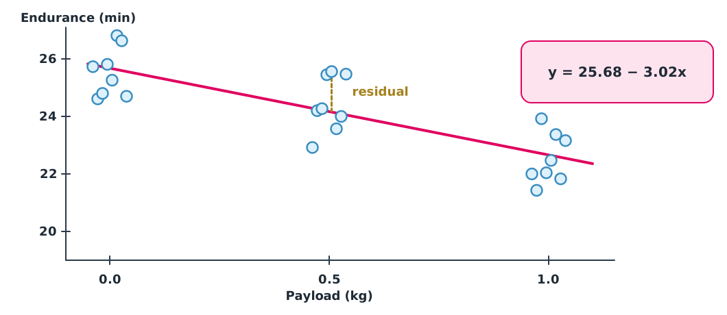
Linear regression finds the straight line that minimises the sum of squared residuals . The slope answers how much endurance changes per extra kilogram.
fit = stats.linregress(df["payload_kg"], df["endurance_min"])
print(f"endurance = {fit.intercept:.2f} + ({fit.slope:.2f}) x payload   R^2 {fit.rvalue ** 2:.3f}")
print(f"slope standard error {fit.stderr:.3f} min/kg")
df["predicted"] = fit.intercept + fit.slope * df["payload_kg"]
df["residual"] = df["endurance_min"] - df["predicted"]
print(df.groupby("payload_kg")["residual"].mean().round(3).to_string())
print(f"residual sd {df['residual'].std():.2f} min   prediction at 0.75 kg {fit.intercept + fit.slope * 0.75:.2f} min")
endurance = 25.68 + (-3.02) x payload R^2 0.671
slope standard error 0.451 min/kg
payload_kg
0.0 -0.131
0.5 0.263
1.0 -0.131
residual sd 0.88 min prediction at 0.75 kg 23.41 minThe slope is −3.02 minutes per kilogram, and says payload explains about two thirds of the variation in endurance. The mean residual at each level is near zero, but it is positive at 0.5 kg and slightly negative at 0 and 1.0 kg. That pattern may hint at slight curvature, so check with more data before relying on a straight-line model.
Do not extrapolate beyond the data
This model was built from payloads of 0 to 1.0 kg. Used at 3 kg it predicts about 16.6 minutes, but the drone may not lift that load at all, or its motors may overheat. Extrapolation needs an engineering reason, not just a longer straight line.
Anscombe’s four datasets
In 1973 the statistician F. J. Anscombe built four datasets with almost identical means, correlation and regression line, which look completely different when plotted.
import statistics

x123 = [10, 8, 13, 9, 11, 14, 6, 4, 12, 7, 5]
anscombe = {
    "I": (x123, [8.04, 6.95, 7.58, 8.81, 8.33, 9.96, 7.24, 4.26, 10.84, 4.82, 5.68]),
    "II": (x123, [9.14, 8.14, 8.74, 8.77, 9.26, 8.10, 6.13, 3.10, 9.13, 7.26, 4.74]),
    "III": (x123, [7.46, 6.77, 12.74, 7.11, 7.81, 8.84, 6.08, 5.39, 8.15, 6.42, 5.73]),
    "IV": ([8, 8, 8, 8, 8, 8, 8, 19, 8, 8, 8], [6.58, 5.76, 7.71, 8.84, 8.47, 7.04, 5.25, 12.50, 5.56, 7.91, 6.89]),
}
for name, (x, y) in anscombe.items():
    line = statistics.linear_regression(x, y)
    print(f"{name:<3} mean x {statistics.mean(x):.2f}  mean y {statistics.mean(y):.2f}  "
          f"r {statistics.correlation(x, y):.3f}  y = {line.intercept:.2f} + {line.slope:.3f}x")
I mean x 9.00 mean y 7.50 r 0.816 y = 3.00 + 0.500x
II mean x 9.00 mean y 7.50 r 0.816 y = 3.00 + 0.500x
III mean x 9.00 mean y 7.50 r 0.816 y = 3.00 + 0.500x
IV mean x 9.00 mean y 7.50 r 0.817 y = 3.00 + 0.500x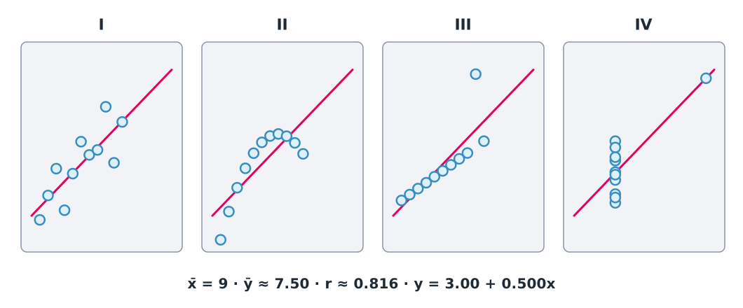
Set I is an ordinary linear relationship. Set II is a curve a straight line cannot describe. In set III one outlier pulls the line, and in set IV the whole slope comes from a single point. The lesson: always plot before trusting summary numbers, both the data and the residuals.
From PX4 logs to tables
PX4 logs are ULog files (.ulg). The pyulog module reads them, either with the ulog2csv command, which turns each topic into a CSV file, or directly from Python. pyulog handles PX4 ULog only, not ArduPilot DataFlash logs. This code needs a real log file, so the automatic check does not run it.
import pandas as pd
from pyulog import ULog

ulog = ULog("flight.ulg", message_name_filter_list=["vehicle_local_position", "battery_status"])
pos = pd.DataFrame(ulog.get_dataset("vehicle_local_position").data)
bat = pd.DataFrame(ulog.get_dataset("battery_status").data)
pos["time_s"] = pos["timestamp"] / 1e6
print(pos[["time_s", "x", "y", "z"]].describe())
print(bat[["timestamp", "voltage_v", "remaining"]].tail())
ULog timestamp values are microseconds since boot, and the z axis of vehicle_local_position points down in the NED frame. Field names can change between firmware versions, so check with ulog_info before writing code.
Module lab
Lab: an endurance model for mission planning
- Plot
endurance.csvas a scatter coloured by battery brand with the regression line, then plot residuals against payload and againstrun_order. - Fit a separate model per brand, compare the two slopes, and write whether the difference matters in practice.
- Plot all four Anscombe sets with matplotlib and write one sentence per set on how to analyse it further.
- If you have a PX4 log from SITL, convert it with
ulog2csvand look at battery voltage against time, stating the limits of simulated data.
Common mistakes
Watch out
- Calculating before checking types and missing values: numbers read as text give wrong results or crashes
- Reading correlation as causation in data that did not come from an experiment
- Skipping the residual plot, so curvature or influential points go unseen
- Using a regression line to predict outside the data range
- Thinking a high means the model is right: Anscombe’s set II has the same as set I, yet a straight line does not fit it at all
Summary
- Check data types, missing values and counts per group before analysing, then summarise with
groupbyandpivot_table - measures only linear relationships and says nothing about cause unless the data comes from a controlled experiment
- A regression slope answers quantitative questions; check residuals and do not extrapolate
- Anscombe’s data teaches you always to plot, and pyulog turns PX4 ULogs into tables for further analysis
Check your understanding
- What does say about payload and endurance?
- Using , what endurance is predicted for a 0.4 kg payload?
- A flight with 1.0 kg lasted 23.0 minutes. What is its residual?
- What does mean?
- Why should Anscombe’s set IV not be summarised with a regression line?
Answers
- A fairly strong negative linear relationship: more payload tends to mean less endurance
- minutes
- The prediction is minutes, so the residual is minutes
- The model explains about 67% of the variation in endurance
- Because the whole slope comes from the single point at x = 19; all other points share one x value of 8, so the data does not show a real relationship
Key formulas
| Pearson correlation coefficient | |
| Least-squares regression line | |
| Residual |
Key references
- McKinney, W. (2022). Python for data analysis (3rd ed.). O'Reilly. link
- The pandas development team. (2026). What’s new in 3.0.0. pandas documentation. link
- The SciPy community. Statistical functions (scipy.stats), SciPy 1.18 documentation. link
- NIST/SEMATECH. Linear least squares regression (section 4.1.4.1). e-Handbook of statistical methods. link
- Anscombe, F. J. (1973). Graphs in statistical analysis. The American Statistician, 27(1), 17–21. link
- Python Software Foundation. statistics — Mathematical statistics functions. The Python standard library (3.14). link
- PX4 Autopilot. pyulog: Python module to parse ULog files (version 1.2). link
- Montgomery, D. C., & Runger, G. C. (2018). Applied statistics and probability for engineers (7th ed.). Wiley. link
Further reading
Study the assigned knowledge units in advance, review media and take the module quiz
In class / field
Lab or field practice from worksheets with a safety checklist
Learning evidence: Checked worksheets and quiz results